A Driving App Hit $100K a Month in 90 Days. An Alarm App Did $200K. A $300K meal planner. A $700K fitness app.
A $100K driving app, a $200K alarm app, a $300K meal planner, and a $700K fitness app — six category breakdowns, and the one design principle every single one of them shares.
September 16, 2026
This edition is a bit different from usual.
Rather than zeroing in on one app or one founder, I want to show you a handful of apps I've come across recently while researching that made me think, "okay, this is genuinely impressive" — apps that are selling extremely well right now.
Normally, I pick a single app or a single developer and go deep — deep enough to fill close to 10,000 words. But there are plenty of apps and cases out there that are worth knowing about, even if there isn't quite enough material to justify that kind of deep-dive treatment on their own.
So this time, I want to pull a handful of those out and show you what makes them impressive.
If you borrow even a little of the concept or strategy behind the apps in this edition, I think you can get an app to a meaningful revenue number. I hope you find something useful in here. Let's get into it.
🚖 "Wheelz": The Driving App That Crossed $100K/Month in 3 Months
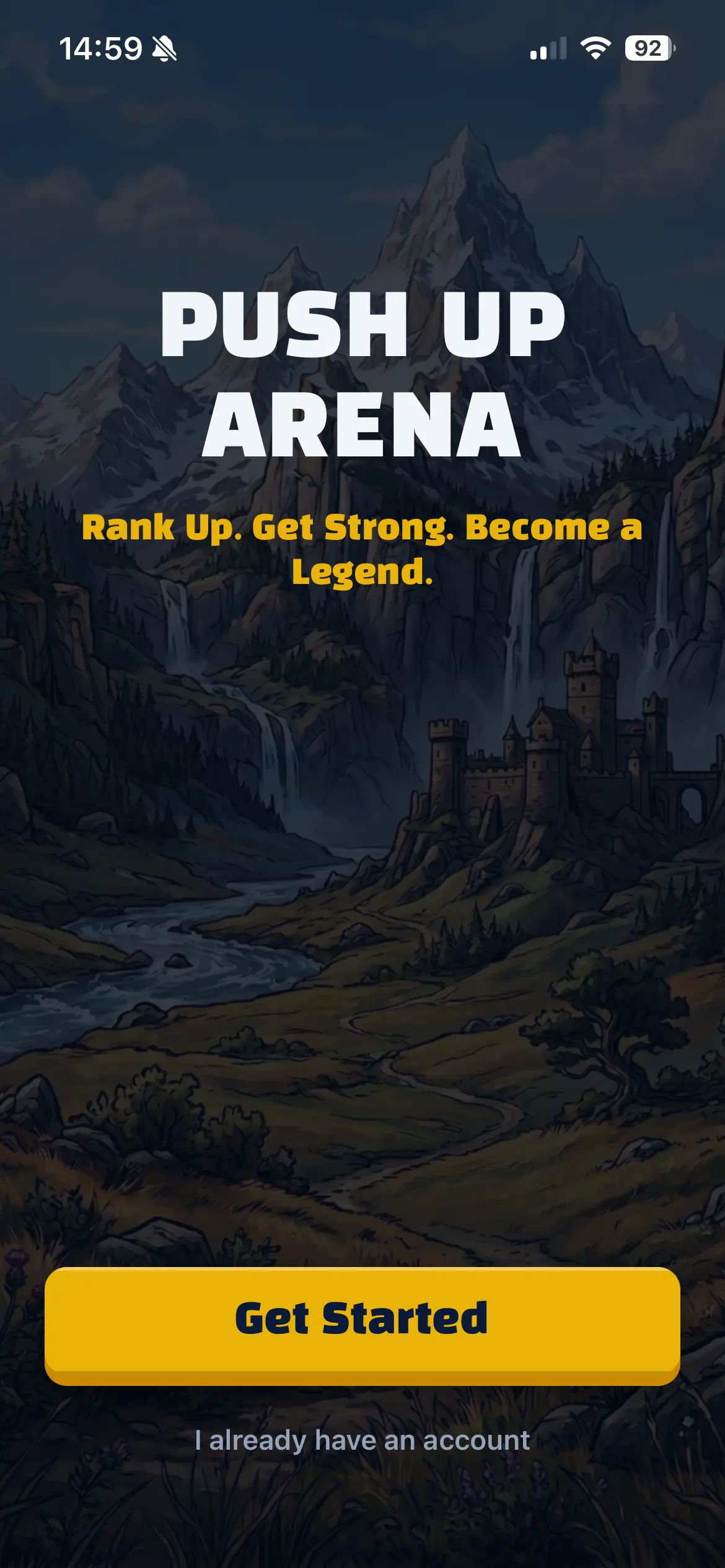
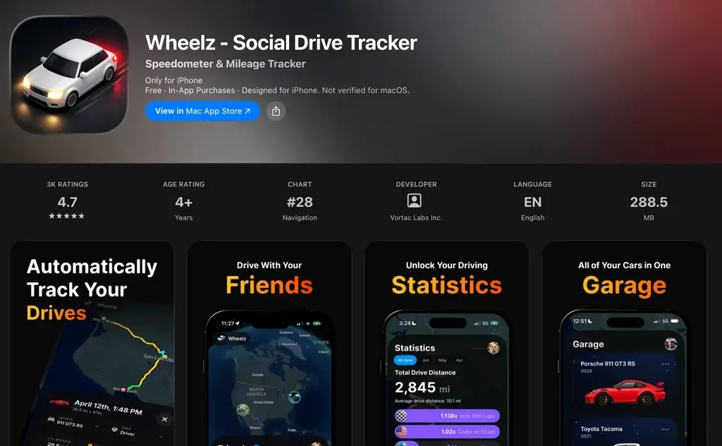
First up is an app that made me go "wait, seriously?" when I found it recently: a driving app called Wheelz.
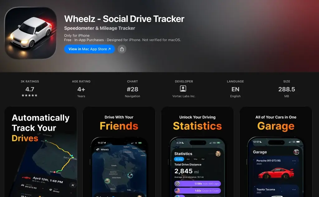
It's a tracking app where users compete against each other on things like distance driven.
There have always been plenty of apps where you compete with other users on running or walking. But I don't think I'd ever seen one built around driving specifically.
That's exactly the gap Wheelz stepped into. Its combination of driving and social competition is genuinely unique.
What's wild is that this app launched in June 2026 — it's only been about three months.
And it's already crossed $100,000 a month in revenue.
So why has this app managed to grow that fast?
The answer, once again, is a TikTok post that went viral.
Here's one of the viral posts 👇
This single post has racked up 1.7 million views. Genuinely absurd numbers.
The hook is: "last one to Arby's has to pay the bill." The video shows a group of cars racing toward an Arby's, all tracked live on a map.
If you watch it, you'll immediately get why this went viral.
One detail that's almost certainly doing a lot of work: the first vehicle shown on the map is a tank. A regular car driving across a map doesn't stop anyone's scroll. A tank does. It's a "wait, what is that?" moment baked right into the first second.
Apps that are designed from the ground up to deliver "an experience that glues the viewer to the screen" like this are extremely strong.
Whoever built this app almost certainly designed it with virality as a first-class goal from day one.
The founder behind Halo AI, which I covered in a previous edition, said something similar — that it's important to design your product around going viral from the very start.
Apps that carry that kind of built-in virality in the product itself are just fundamentally strong.
To pull that off, you need features and a design that keep users glued to the screen, plus a hook that actually grabs people emotionally. Every time you're building an app, or building a new feature, that's a lens worth keeping in your head.
Just as important as acquisition, though, is onboarding design.
Wheelz's onboarding runs about 21 screens. It opens by having you set up your vehicle 👇
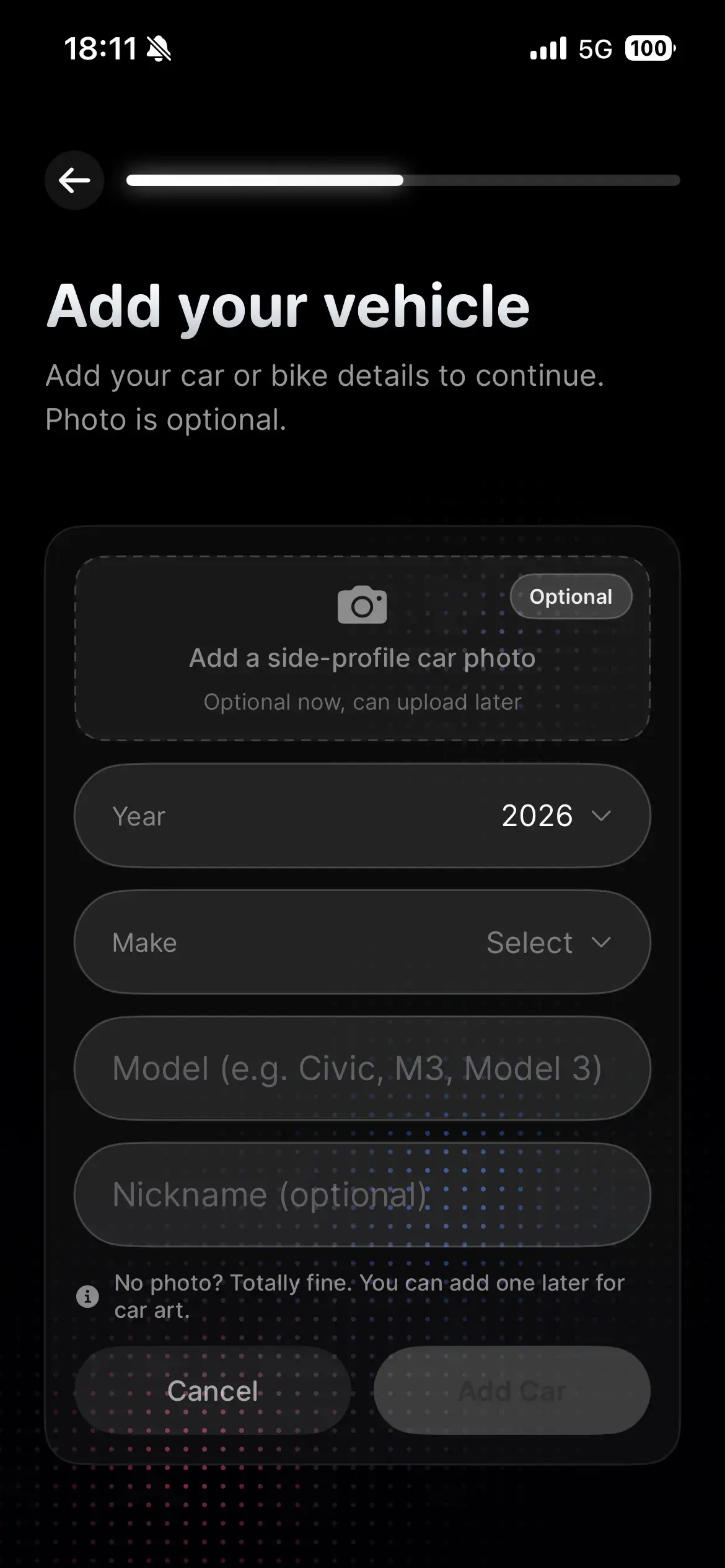
Then, to actually use the app, it requires you to turn on location tracking and notification permissions — and you literally cannot continue through onboarding until you do 👇
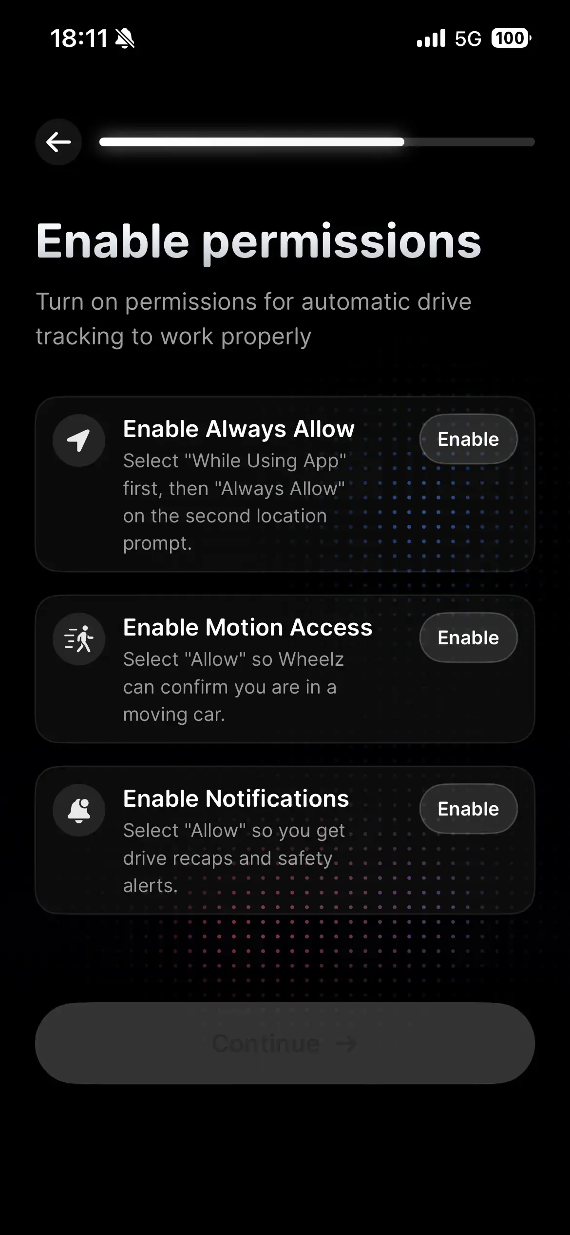
Most apps let you tap through onboarding even with those permissions left off. This is a notably strict design in comparison.
But I think that's deliberate — it filters out anyone who isn't motivated enough to actually pay for the app, and weeds out users who were never going to convert anyway.
It also spends real onboarding real estate on driving safety, clearly trying to minimize the odds that using the app itself causes an accident.
Then a "Setting Up" screen appears, and finally the paywall shows up.

Only the annual plan comes with a 7-day free trial, which tells you they're clearly pushing users toward the annual option.
It's unusual to see an app offer annual, monthly, and weekly plans all at once — most stick to two.
You can back out of the paywall by tapping the X, and a limited version of the app is usable for free. But the second you try to use the 3D map feature — the exact thing going viral on TikTok — you hit a paywall.
Between the app's theme, and the way it's engineered its own virality, I thought this one was executed beautifully.
Building an app with AI has genuinely gotten easy. Success now comes down to the idea. Let's keep building.
Wheelz's full onboarding flow and its viral posts are both up on the app database I run — go take a look 👇
Up until now, I'd only had onboarding flows in that database, but this month I shipped a new feature that surfaces an app's viral social posts too, so you can now see the actual posts driving growth for a bunch of apps that are selling well.
If you sharpen both your social posts and your onboarding at the same time, I genuinely think you can grow any app. Take a look and see what you can borrow.
⏰️ Alarm Apps Doing $200K+ a Month
Next up: alarm apps.
You'd think alarm apps would've been done to death by now as a basic utility category. And yet, right now, several alarm apps are going absolutely viral.
Take an app called Wayk, for example 👇
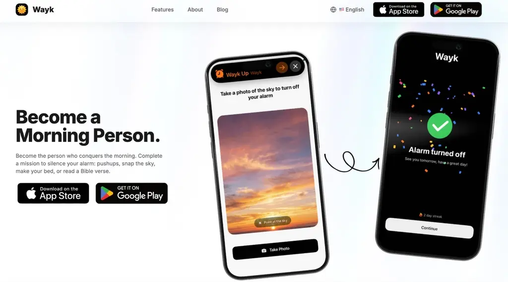
It's a rapidly growing app pulling in over $200,000 a month.
The premise: your alarm won't stop until you complete a specific mission.
And there are several different mission types 👇
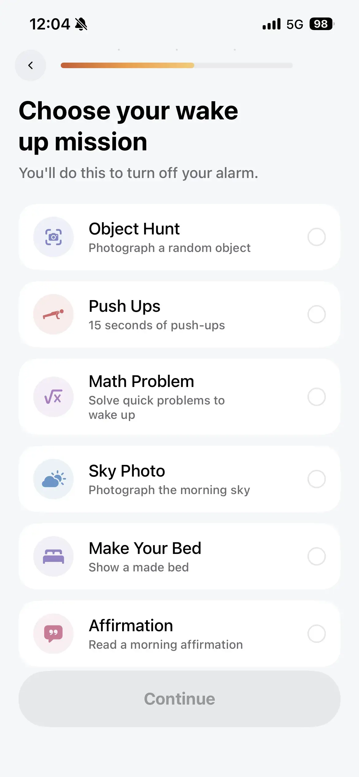
The standouts are "Object Hunt," where you have to find a randomly assigned object and photograph it, and "Push Ups," where you literally have to do push-ups. Both are wildly viral.
For instance, this TikTok video absolutely blew up.
2.8 million views on this one.
It shows someone frantically photographing their toilet to shut off the alarm.
Same story as Wheelz — the virality is baked into the product itself.
Watching someone scramble to find an object to photograph, or drop and do push-ups on command, is genuinely hard to look away from.
And because the virality comes from the product itself, the conversion rate from "watched the video" to "downloaded the app" is almost certainly very high.
Broadly, there are two patterns for short-form app-promo videos.
One: there's some other piece of content that goes viral on its own, and the app gets slipped in as a mention.
Two: the act of using the app, or showing off a feature, is itself what goes viral.
Obviously, the second pattern converts dramatically better. Which is exactly why baking virality into the product itself matters so much.
And once someone downloads the app, onboarding is what turns them into a paying user.
Wheelz's onboarding, from earlier, ran 21 screens. Wayk's runs a full 43.
It opens with a run of screens designed to make you confront the fact that you can't wake up on your own 👇
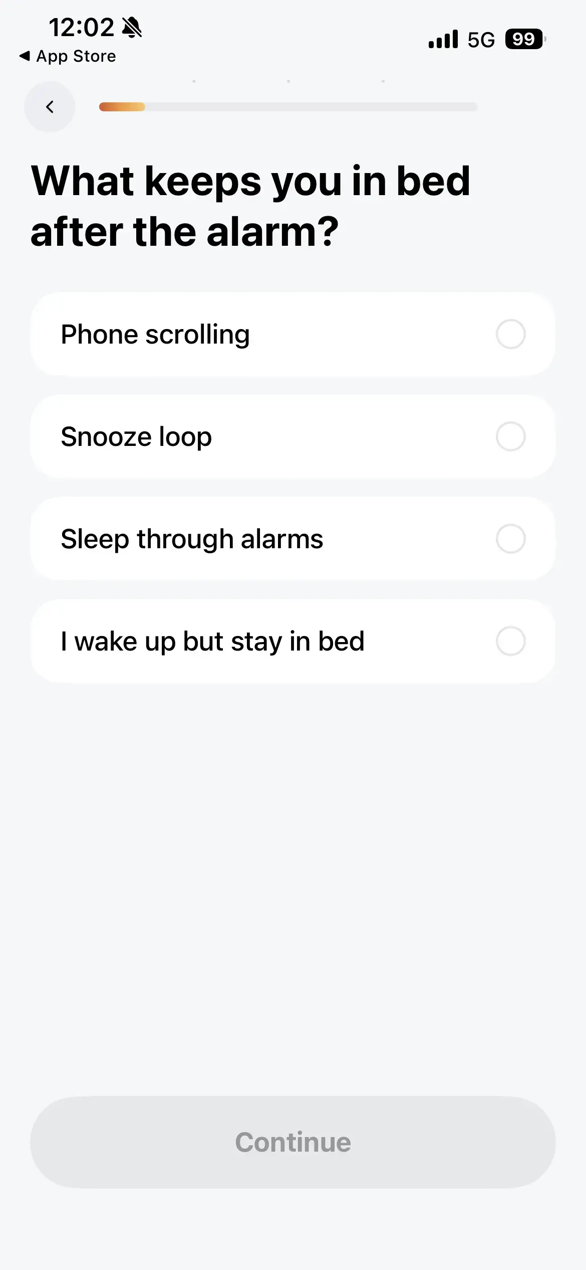
Partway through the questions, it slips in a screen making the case for Wayk's value 👇
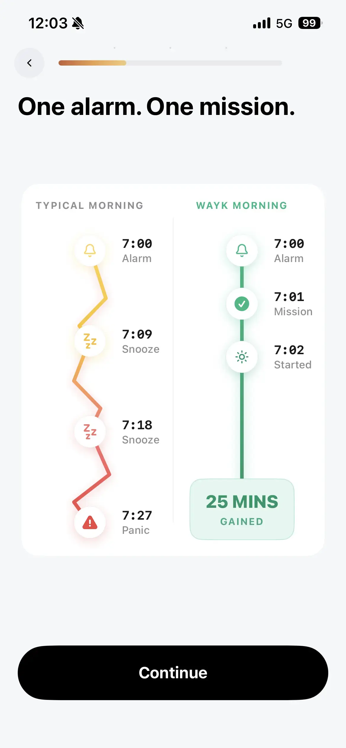
It's long, but the UI stays simple and easy to follow — polished onboarding that doesn't feel like it's constantly selling at you.
Once the questions wrap up, it shows a screen designed to extract a commitment via a signature-style gesture 👇
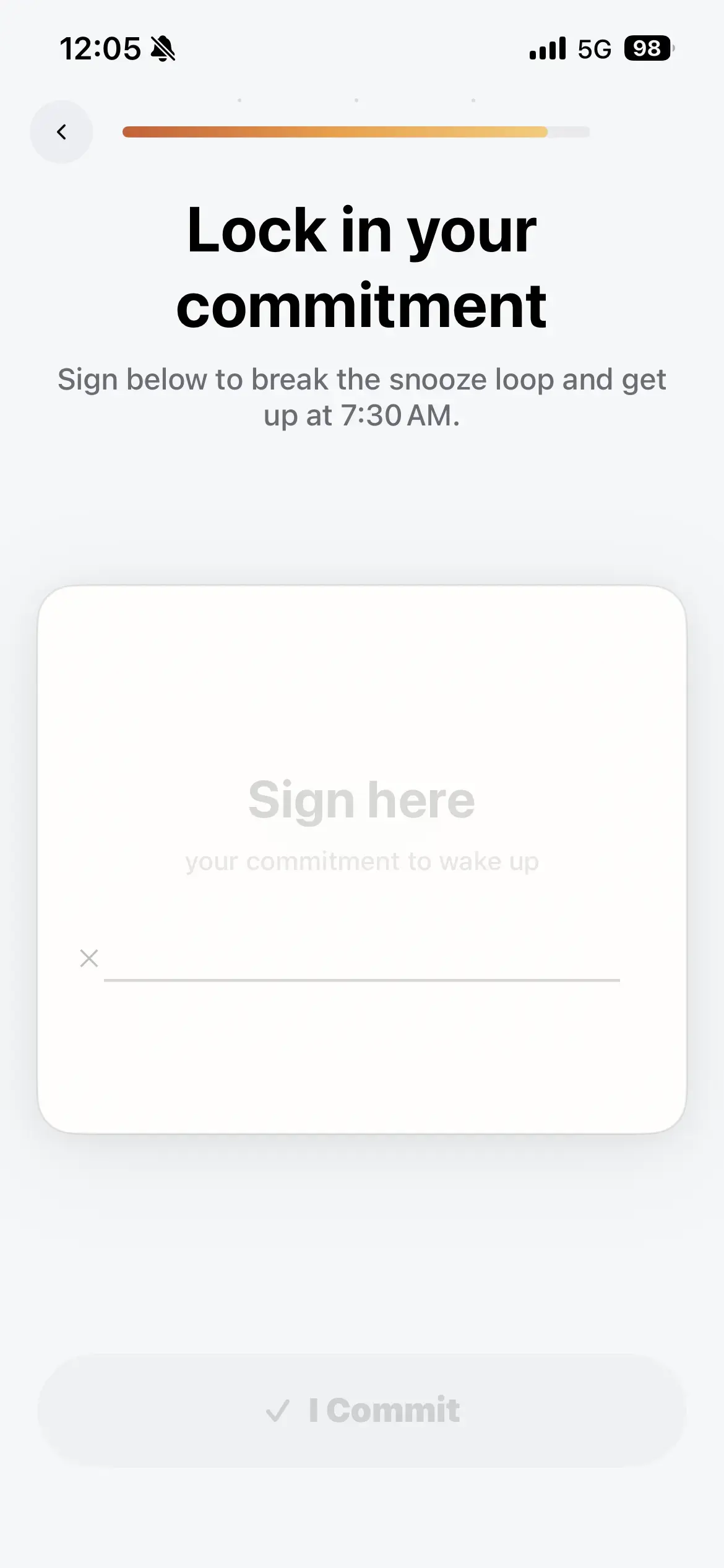
Commitment screens like this are common in habit-formation apps specifically — they're used to pull a commitment out of the user and lift conversion.
Then a personalization screen shows up,
followed by the paywall 👇
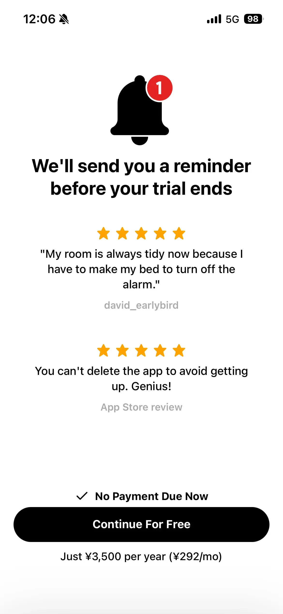
Pricing is on the cheaper side — roughly $23 a year, and that's the only plan on offer. Comes with a 7-day free trial.
If you back out of the paywall, it shows a secondary two-week trial offer 👇
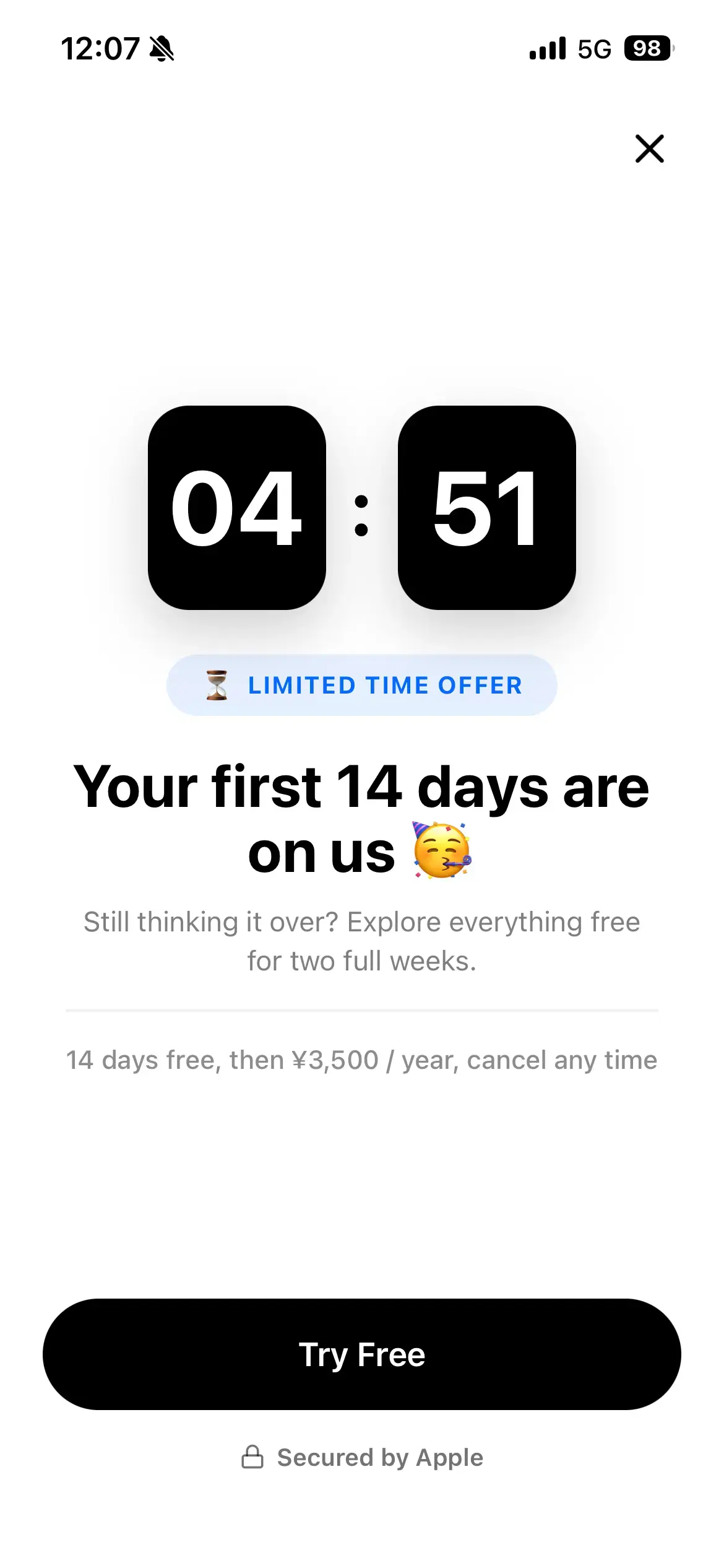
That's there to minimize the number of users who reach the paywall and then just... leave. Conversion is almost certainly very high.
Wayk is genuinely good at both its social strategy and its onboarding design. This is going to keep selling.
Even in a theme as old and seemingly saturated as alarm apps, a small shift in the idea plus solid marketing is enough to grow this far.
There's another app growing off the exact same playbook and the exact same theme: Erly.
It's going viral with essentially the same hook on social.
One creator's video for it has racked up an absurd 15.8 million views.
Same Object Hunt-style mission to kill the alarm.
It opens on someone's crying face — and that's a strong choice. UGC videos that open on a crying or shocked expression are strong on purpose.
That alone is enough to hook a viewer into thinking "wait, what's going on here?" and keep watching.
Erly's onboarding also runs long, at 41 screens.
On a related note, there's an app called Clucky that launched riding this same alarm-app wave. Its UI/UX was genuinely excellent and it went viral — but the virality ended up being a flash in the pan.
The reason it fizzled: it went viral on X, not TikTok. X skews heavily toward developers, designers, and other business-minded users, so that's who it went viral among.
In other words, it never actually reached the people who genuinely need an alarm app — its real target audience.
If you're trying to grow a consumer (toC) app, short-form video marketing on TikTok or Instagram is the effective channel.
If you're building a tool aimed at developers or founders, X is the effective channel.
I feel like there's a common pattern of solo developers building a toC app, launching it on X with a "just shipped this!" post, and then — even after it goes viral — ending up disappointed that "way fewer users came in than I expected, and revenue isn't really happening."
But that's exactly what you'd expect, because the post never reached the actual target audience in the first place.
If you're building something for other indie developers, X makes total sense. But if you're building something like a toC journaling app and launching it on an X account with a big indie-developer following, you can go viral there and it still won't translate into real revenue.
As it happens, the two products I'm currently focused on are a Japanese-learning app and this very app database, Onbo Hub. I don't post feature updates for the Japanese-learning app on X at all.
Growth for the Japanese-learning app runs almost entirely through Instagram and TikTok, and its whole audience is overseas. There's zero reason to be posting about it on Japanese X.
Onbo Hub, on the other hand, gets updates and content posted to X constantly — because the indie developers I'm connected with on X are exactly Onbo Hub's target audience.
The lesson: figure out which channel your actual target audience lives on, and market there.
Back to Clucky for a second — the developer behind it actually runs a design studio as his main business. In a sense, his marketing worked out fine anyway.
Even if Clucky itself never takes off as a standalone app, the design chops and viral instincts on display in it almost certainly generated a decent number of inbound inquiries from other developers and founders who saw it.
So, that covers the driving app and the alarm apps that have been growing fast lately.
From here, let's look at some apps that are selling even better, plus a couple of app themes that seem to stay strong no matter what era we're in.
Specifically:
An AI meal-planning app that's also been growing fast lately (roughly $300K/month in revenue)
Fitness apps, which are perennially strong (roughly $700K/month in revenue)
AI calorie-tracking apps, which are just absurdly strong as a category
The AI meal-planner category genuinely surprised me — I didn't expect a theme like that to still have this much room to grow, and it's going viral and growing fast right now.
The reason, again, comes down to a genuinely viral feature baked into the product. And fitness and calorie-tracking apps are simply evergreen — strong in any era.
Let's get into why they're strong, and exactly how these apps are growing.
🍳 The Meal-Planning App Doing $300K+/Month
Another category I ran across recently that's selling well: meal-planning apps.
The standout, growing fast, is an app called mise.
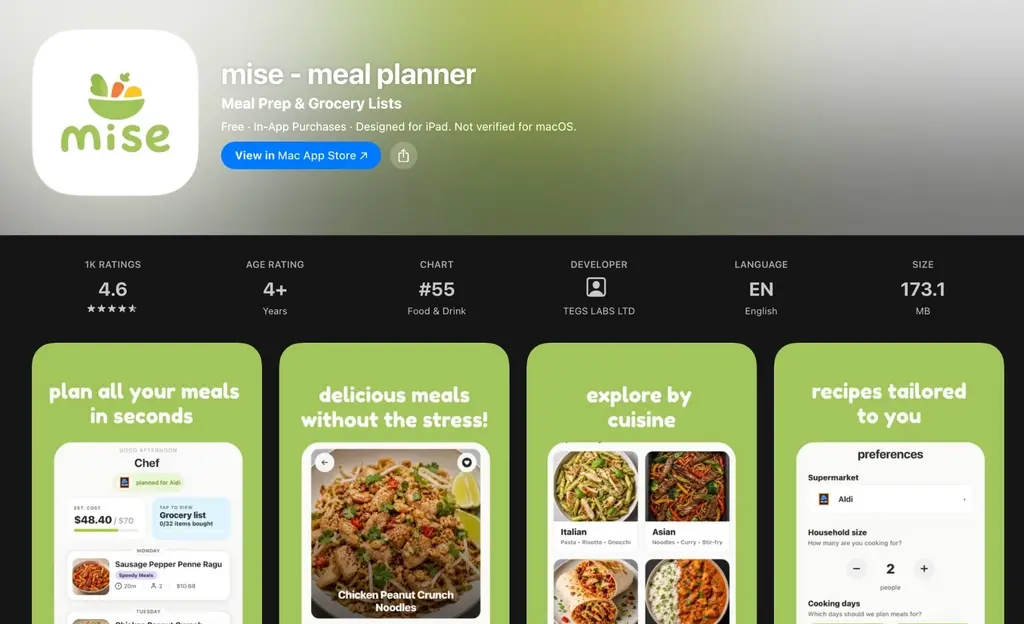
It hits a real pain point — people who find deciding what to cook every day genuinely exhausting.
It suggests meals based on your budget and food preferences, then builds a shopping list around whatever it suggested.
I remember "plan tonight's dinner for me" being one of the early example use cases people threw around when ChatGPT first launched.
But not many people actually turned that into a dedicated app and seriously tried to sell it.
And now, out of nowhere, this meal-planning category is selling extremely well.
Let's start with the onboarding.
It runs 29 screens.
It opens with a run of pain-point questions that, at first glance, looks like any other app's onboarding. What stands out is that it also asks where you live and which supermarket you usually shop at 👇
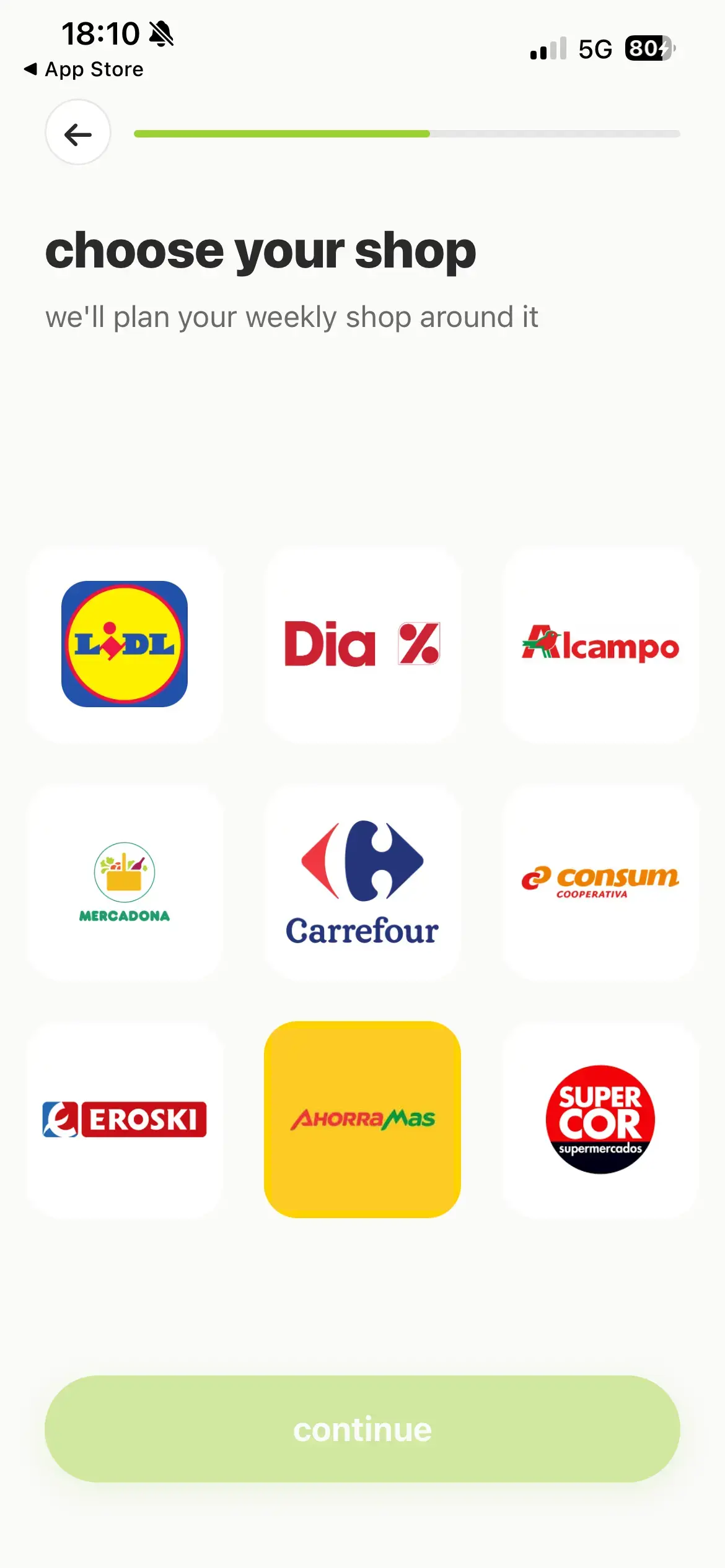
Having that screen exist at all makes the whole experience feel far more personalized.
When I actually tried the app, I couldn't find any feature that genuinely used your specific supermarket to personalize anything — so my read is that it's mostly there to manufacture a sense of personalization.
It also asks what kitchen equipment you have at home 👇
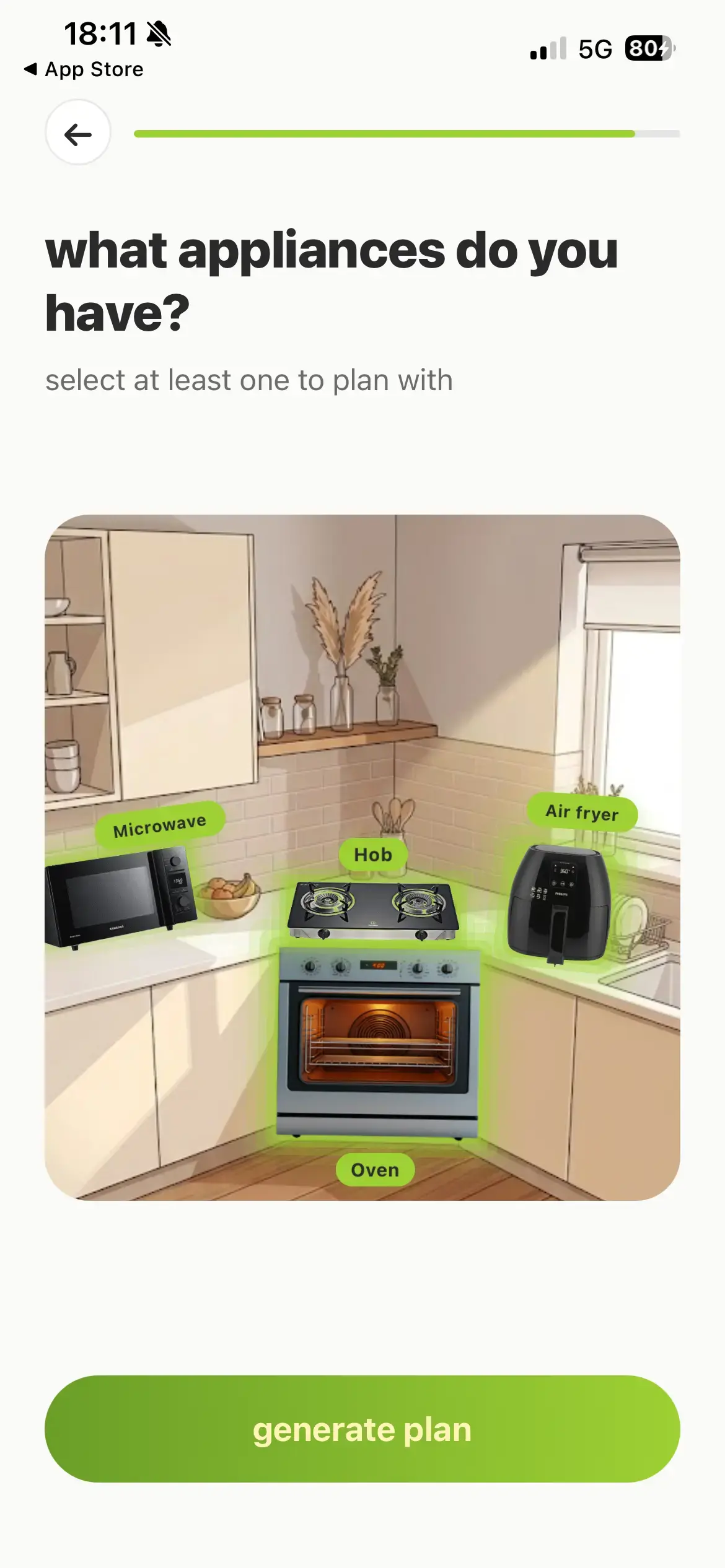
Rather than just handing you a list of checkboxes, it has you pick your equipment straight off an illustrated kitchen — a genuinely nice piece of UI/UX.
Partway through onboarding, there's a screen asking roughly how much you spend on food 👇
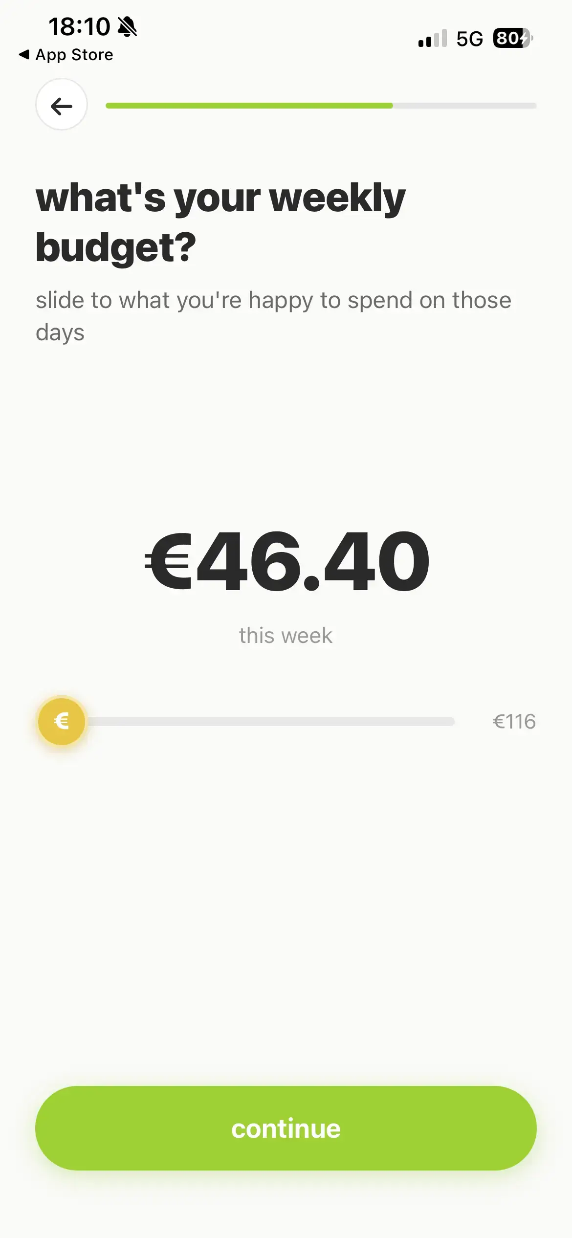
Once you enter a budget there, it shows you roughly how much you could save 👇
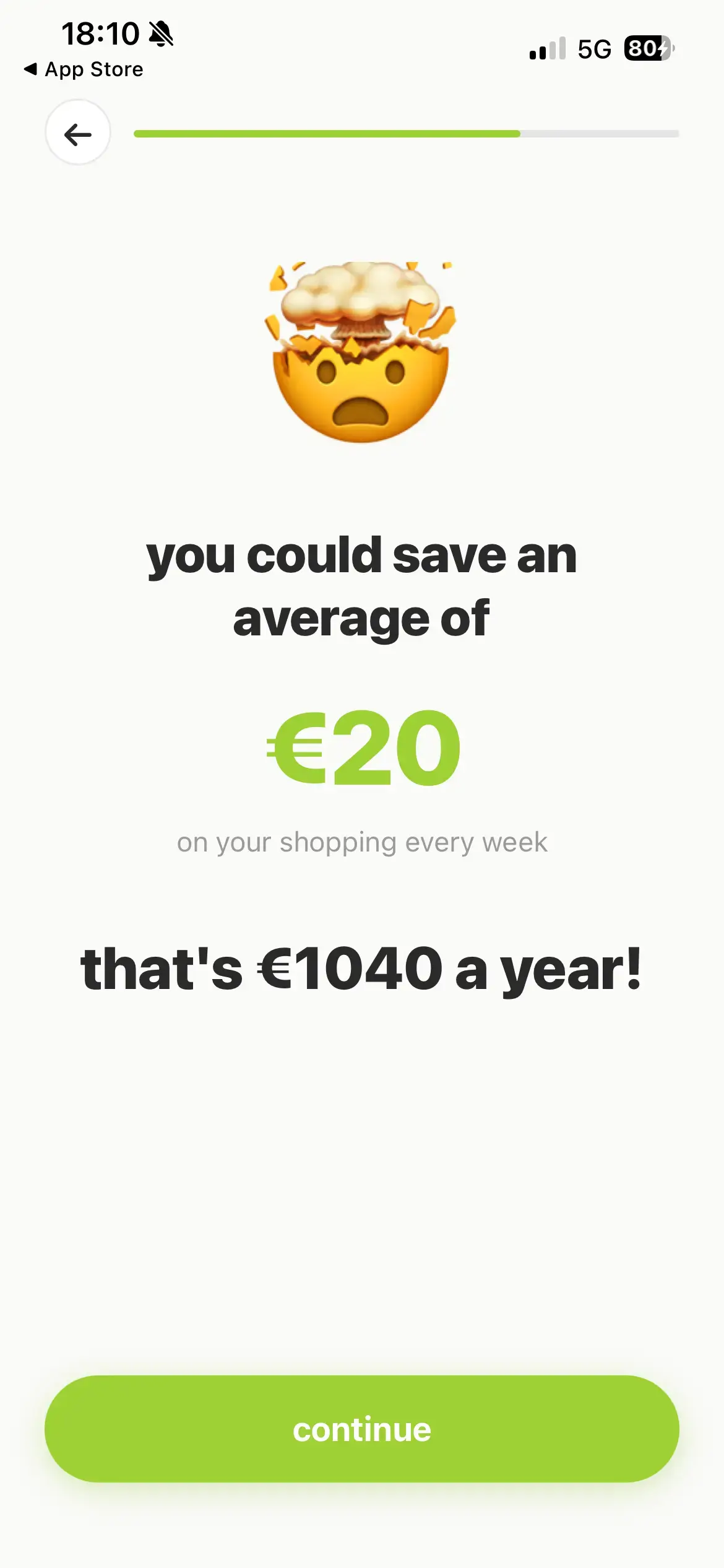
I have no idea what logic is actually generating that number, but a "you'll come out ahead financially" pitch like this is a genuinely powerful lever for conversion.
The app itself runs around $40 a year — and if it's actually saving you more than that, why wouldn't you use it.
So, roughly speaking, this is a well-built flow that gets the user mentally ready to buy before they even reach the paywall.
And looking at its viral TikTok posts, that same "pick your usual supermarket" screen from onboarding shows up as the strongest hook 👇
The hook text that opens this video: "been shopping at Aldi for 8 years and Now I find this???"
It's paired with a surprised, slightly frustrated face, followed immediately by the supermarket-selection screen.
This "I can't believe I didn't know about this for years" framing, paired with that kind of expression, is a classic short-form hook — and I've seen the exact same structure go viral for other apps too.
For instance, the solo-travel social app Nomadtable, which I covered in an earlier edition, went viral with basically the same structure 👇
Posts like this tend to go viral easily, and they also seem to convert well from view to download.
And for this meal-planning app, it's clear that the "pick your supermarket" screen itself is functioning as a genuinely strong hook.
Worth repeating: it really pays to design your features and screens starting from "what would make a strong hook for a short-form video," rather than the other way around.
There's another meal-planning app selling well using a similar playbook: an app called Miso 👇
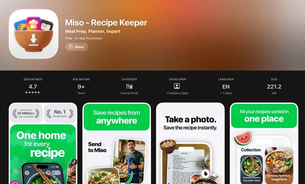
Unlike mise, it doesn't have a supermarket-selection feature. Instead, it pushes a feature that lets you pull in recipes that are going viral on social media.
I thought this was genuinely useful. If you see a recipe video on social that catches your eye, you can send it straight to Miso and it'll generate the recipe for you.
It walks you through this "pull a recipe in from social" flow clearly during onboarding, and actually lets you experience a recipe getting generated in real time.
Near the end, there's also a commitment button you hold down to bring a pot to a boil — hold the button and the pot visibly simmers before you move to the next screen.
Small gimmicks like that are what keep onboarding from getting boring as it drags on.
Then, at the paywall, you're given a choice between a 3-day free trial and a 30-day trial for roughly $3.
The moment I saw this, it clicked for me.
The standard paywall setup is a free-trial annual plan sitting next to monthly and weekly options. This one instead anchors everything to the annual plan, and offers a free trial alongside a 30-day paid trial as the two choices — and that might genuinely be a smart move.
Psychologically, having two options on the table tends to convert better than having just one.
And at first glance, "a 30-day trial for roughly $3" sounds like a steal. But the annual plan itself is only around $40, so that "trial" is really just letting you pay month-to-month for the first month of what's fundamentally an annual subscription.
Whether you'd really call that a "trial" is debatable. But laid out side by side like this, I'd bet plenty of people end up picking the 30-day option.
This paywall pattern seems genuinely worth testing yourself.
💪 The Fitness App Clearing $700K+/Month
Next: fitness apps.
I've looked at a lot of app categories at this point, but fitness is still one of the ones that reliably makes real money.
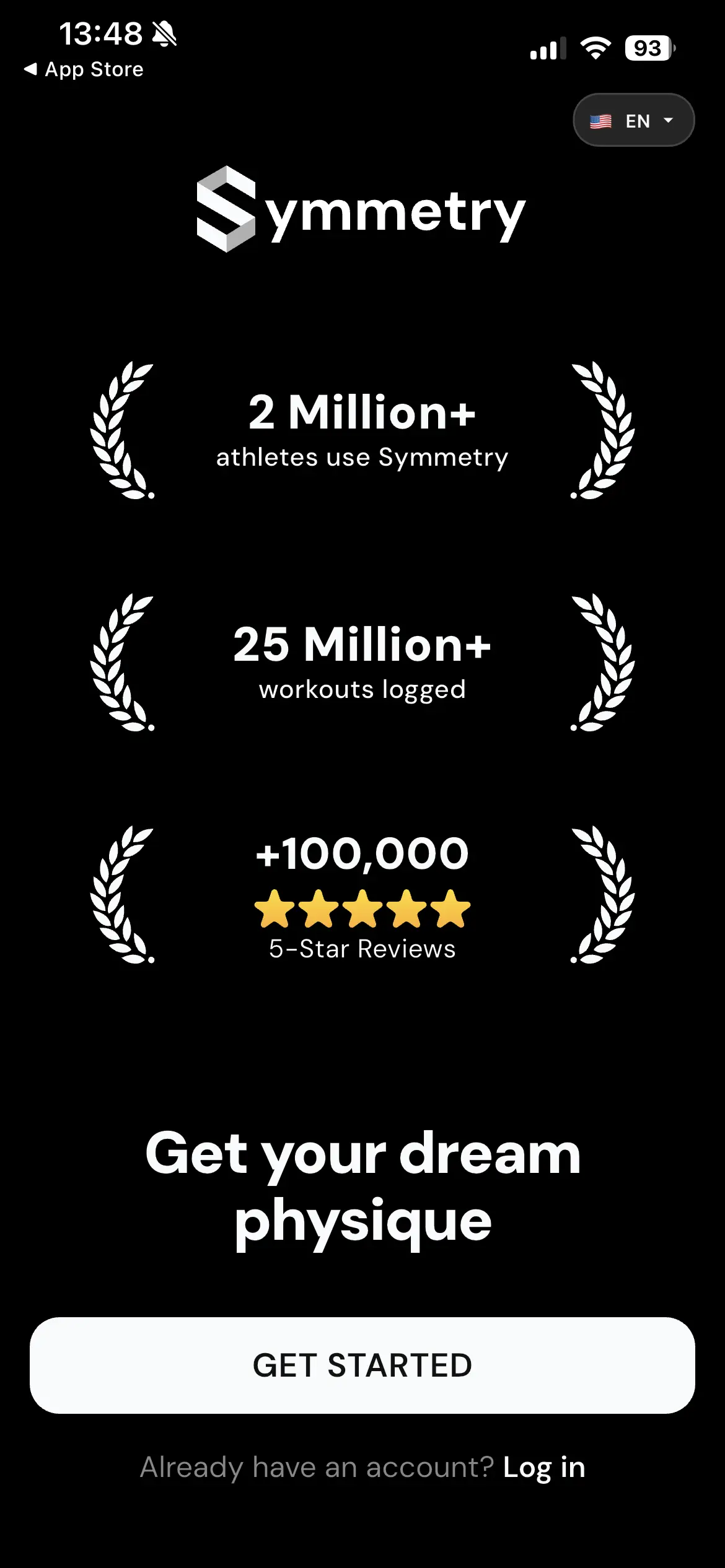
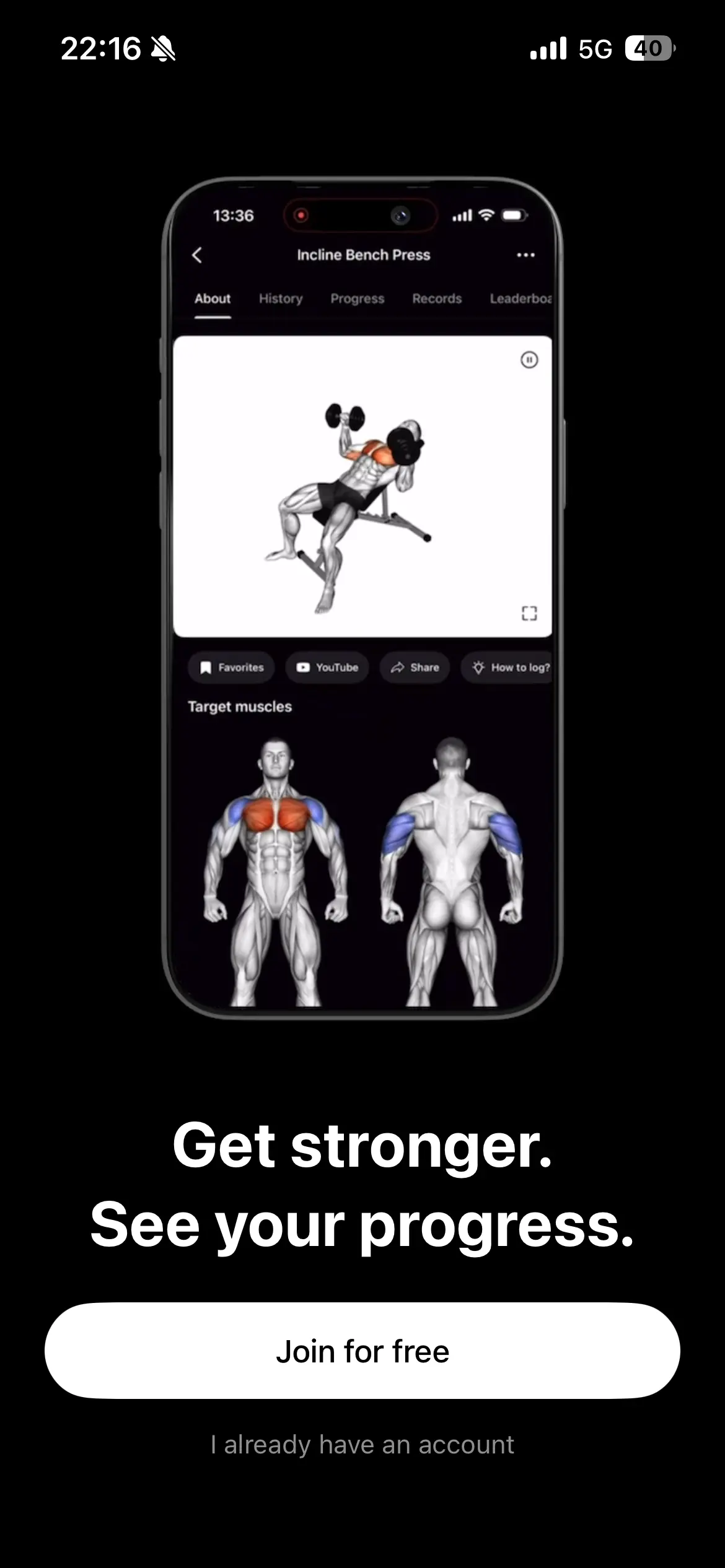
Take an app called Liftoff, for example — it's doing over $700,000 a month.
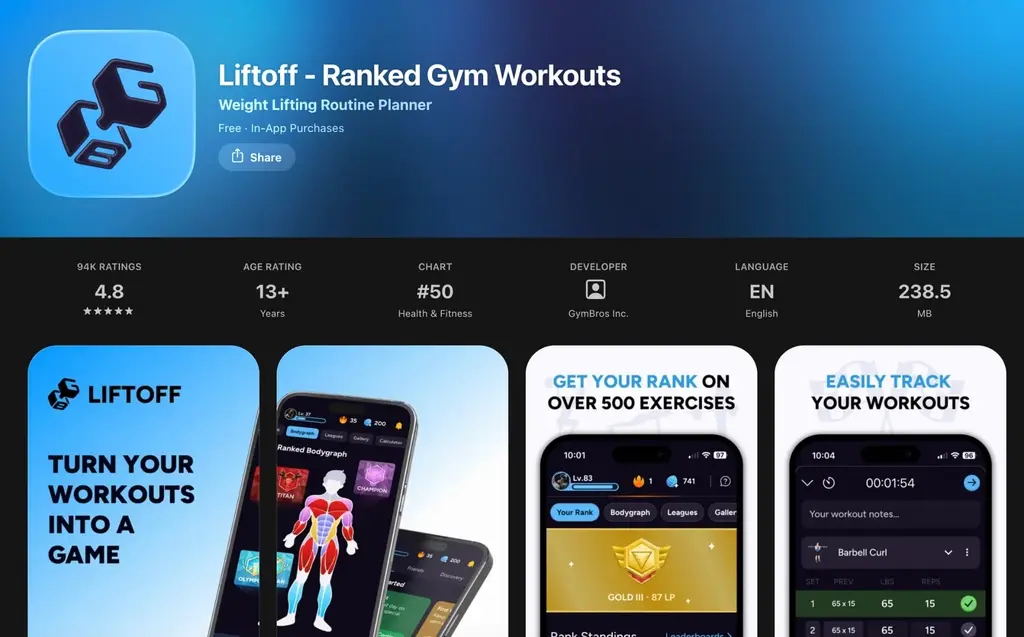
The concept: track your gym workouts and compete against other users.
What stands out about this one is how absurdly long its onboarding is. Every app I've covered so far already had a reasonably long onboarding — Liftoff is in a different league entirely.
The whole thing runs 55 screens.
But it's guided the whole way by a mascot elephant character, which keeps it from feeling as exhausting as 55 screens sounds.
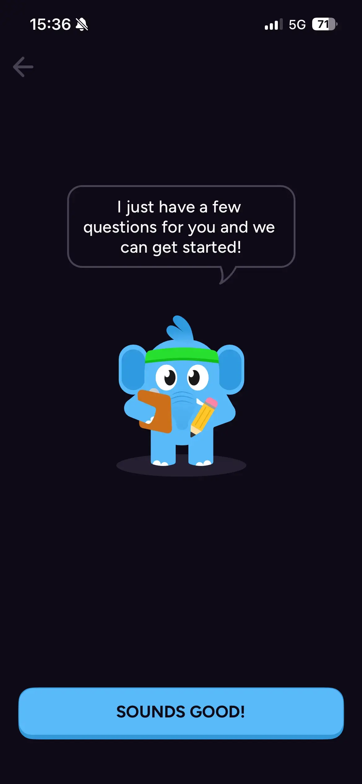
Relatively early on, there's a screen designed to pull a commitment out of you.
You press your thumb against the screen to signal your commitment, then move on.
And the final paywall follows the same pattern as Miso above — a free trial and a 30-day trial shown side by side.
Longer onboarding isn't automatically better. But 55 screens is still converting extremely well here. A lot of apps that sell well have absurdly long onboarding flows.
Habit-formation apps in particular tend to run long onboarding.
My read is that the length itself is what extracts more commitment from the user, which then translates directly into a higher conversion rate.
If you're building a habit-formation app, it's probably worth gradually extending your onboarding and watching how conversion trends as you do.
Gym-themed apps also seem to have an inherent advantage: muscle itself is an incredibly strong hook, which makes acquisition easier.
Just showing someone visibly muscular working out or showing off is, on its own, enough of a hook to stop a scroll 👇
Fitness is inherently a theme that makes money, so competition is fierce too — but if you can nail TikTok virality, even a brand-new app in the space can grow.
In fact, going after a lucrative, crowded category with a strong TikTok strategy is arguably a smart way in, not a risky one.
There's another fitness app called Lyfta that's apparently pulling in roughly $300,000 a month 👇
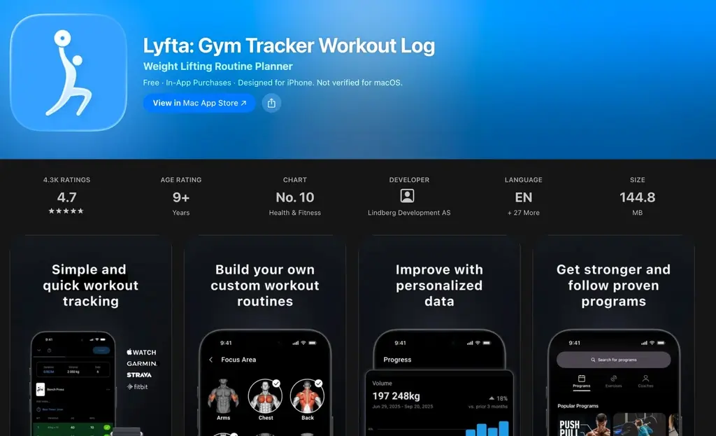
This app has been going absolutely viral on TikTok, and its TikTok strategy is exceptionally sharp.
For example, one video shot to look like a hidden-camera angle of a woman using the app at the gym racked up 3 million views 👇
The hook text, "Girl live in 2099," is doing a lot of work. It makes you think "wait, what app is she even using?" and watch all the way through.
And the app's name is never actually shown in the video itself — it only appears in the caption.
This approach could probably work for categories well outside fitness too.
If you can film something shot like a hidden-camera glimpse of someone using an app, and make a viewer go "wait, what is that app?", that's a genuinely strong format.
It's an ad, but it doesn't feel like one. Strong technique.
🥦 AI Calorie Apps Are Still the Most Profitable Theme Out There
Last category: calorie-tracking apps.
If you had to name the single most successful toC app of the last few years, Cal AI would be near the top of pretty much anyone's list.
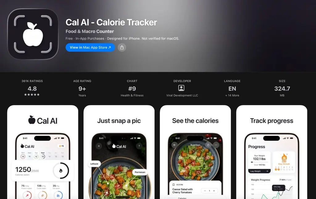
In under two years from launch, it grew into a monster doing roughly $5.7 million a month, and it was acquired by a major company in March 2026.
The concept: photograph your food, and AI analyzes it and extracts calories, protein, fat, and so on, so you can track it. Even though it's marketed as "AI," what's almost certainly running underneath is an API from a foundation-model company like OpenAI.
But they wrapped that in genuinely usable design and scaled it with borderline reckless marketing intensity.
One thing worth noting about this AI calorie-tracking theme specifically: compared to other AI-wrapper categories, it's structurally cheap to run — which is a real advantage.
Language-learning apps or flashcard-generation apps tend to burn through API calls fast, and usage is basically unbounded, so depending on your design and how users actually use it, API costs can spiral.
Calorie tracking, though, gets used at most a handful of times a day. Nobody's eating dozens of meals a day, so the number of times it actually gets used is inherently capped.
And yet, it's exactly the kind of app people open every single day without fail, so it worms its way into daily life regardless.
Used every day, but with a hard ceiling on frequency — which keeps costs from ballooning.
High margins mean the profit you generate can go straight back into further investment.
I think that structural advantage is a big part of why Cal AI managed to grow as fast as it did.
And interestingly, the alarm apps from earlier in this edition share the exact same structure!
Used every single day, but in principle only once a day.
Which is why running image analysis for something like push-up tracking or Object Hunt doesn't rack up much cost either.
Going after app themes with this kind of profitable structure seems like a genuinely solid strategy.
Following Cal AI's success, a wave of calorie-tracking apps has shown up.
And these copycat apps are genuinely making solid revenue too.
Once again: an app in an already-proven, high-selling theme sells, even as a late entrant.
For example, an app called CleanEats launched well after Cal AI and still crossed $10,000 in revenue within two weeks of launch.
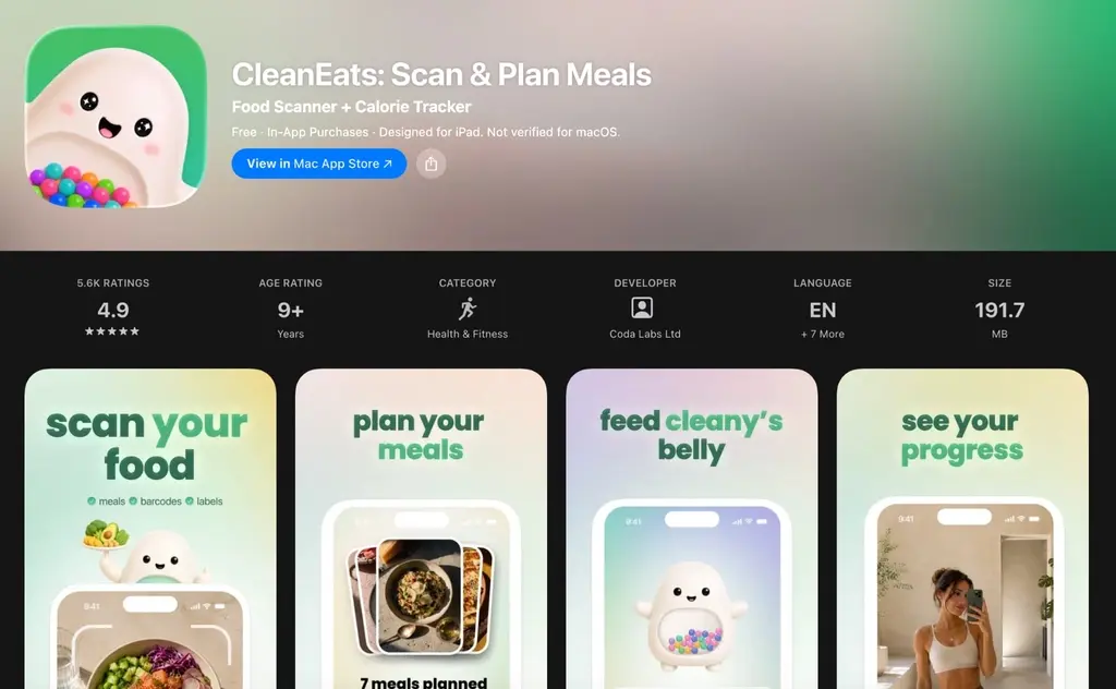
Its actual revenue by now is almost certainly higher.
Calorie apps like this are strong because they can go viral off nothing more than "someone photographing their food and getting a calorie count" — the video is just someone using the app 👇
You'd think there's nothing novel left in that format, but apparently it can still go viral.
You can weave the app usage naturally into a breakfast/lunch/dinner vlog-style video, which means there's a huge range of possible formats.
It's also a theme that fits naturally into an influencer's existing content without feeling like a forced ad.
On a related note: I once did a deep dive on Cal AI's marketing lead, and one thing he said stuck with me.
His point was that some apps are easy for influencers to sell, and some aren't.
If an app competes directly with the backend product an influencer is already selling, it becomes hard for them to promote it.
For instance, an influencer who posts about relationships is often selling appearance-improvement advice or dating coaching as their real backend product.
Pitch a partnership to them for an AI app that also does appearance advice or dating advice, and they're unlikely to bite — they'd rather just sell their own thing.
Health-focused influencers, on the other hand, are usually selling diet supplements or fitness coaching programs as their backend product.
A calorie-tracking app doesn't compete with that at all, so the odds an influencer agrees to partner go up significantly.
Deliberately building "an app influencers find easy to promote" is genuinely hard to pull off on purpose, but it's a lens worth keeping in mind.
So: calorie apps go viral, sell well, and run on great margins. A genuinely strong theme on every axis.
There was recently a case that made some noise — someone took the exact same concept as Cal AI, localized it for the Arabic-speaking market, and cleared $80,000 a month almost immediately.
📝 Wrapping Up
So that's a slightly different-flavored edition this time — a look at a handful of apps that are genuinely selling right now.
I normally focus each edition on one app or one developer and go deep. But I think there's real value in doing an edition like this too — pulling together apps that don't individually have enough material to fill an edition on their own.
I'd like to keep doing roundup editions like this from time to time, alongside the usual deep dives.
Thanks for reading all the way through! If anything caught your attention or you have questions, just hit reply — I read everything.
And if you post your thoughts on X and mention me, it makes my day. I always respond.
See you next time.
References
Wheelz, viral TikTok post: https://www.tiktok.com/@wheelz.app/video/7676225143307275542
Wheelz's onboarding and social posts: https://onbo-hub.com/apps/wheelz
Wayk, viral TikTok post: https://www.tiktok.com/@wayk.app/video/7666515910206737677
Wayk's onboarding and social posts: https://onbo-hub.com/apps/wayk
Erly, viral TikTok post: https://www.tiktok.com/@biancawakesup/video/7635814082850884884
Erly's onboarding and social posts: https://onbo-hub.com/apps/Erly
Clucky, on X: https://x.com/heysatya_/status/2090159517644583280
Umatan on X, on channel-audience fit: https://x.com/statistics1012/status/2094976354177655198
mise, viral TikTok post: https://www.tiktok.com/@carla.eatsss/video/7662440104488684813
mise's onboarding and social posts: https://onbo-hub.com/apps/mise
Miso's onboarding: https://onbo-hub.com/apps/miso
Liftoff, viral TikTok post: https://www.tiktok.com/@bjarnson_fitness/video/7649037861110533389
Liftoff's onboarding and social posts: https://onbo-hub.com/apps/liftoff
Lyfta, viral TikTok post: https://www.tiktok.com/@majlindaha/video/7560411479283895574
Lyfta's onboarding and social posts: https://onbo-hub.com/apps/lyfta
Cal AI's onboarding and social posts: https://onbo-hub.com/apps/cal-ai
CleanEats, viral TikTok post: https://www.tiktok.com/@evaspilates/video/7651697705592376609
CleanEats's onboarding and social posts: https://onbo-hub.com/apps/cleaneats
Halo AI deep dive (previous edition): https://umatan.m-newsletter.com/posts/ai-photo-app-rapid-growth-story
Nomadtable deep dive (previous edition): https://umatan.m-newsletter.com/posts/us-engineer-travel-app-success-story
Cal AI / Zack Yadegari deep dive (previous edition): https://umatan.m-newsletter.com/posts/zack-yadegari-app-success-story
Cal AI marketing lead deep dive (previous edition): https://umatan.m-newsletter.com/posts/sway-ai-matching-app-profile-tips